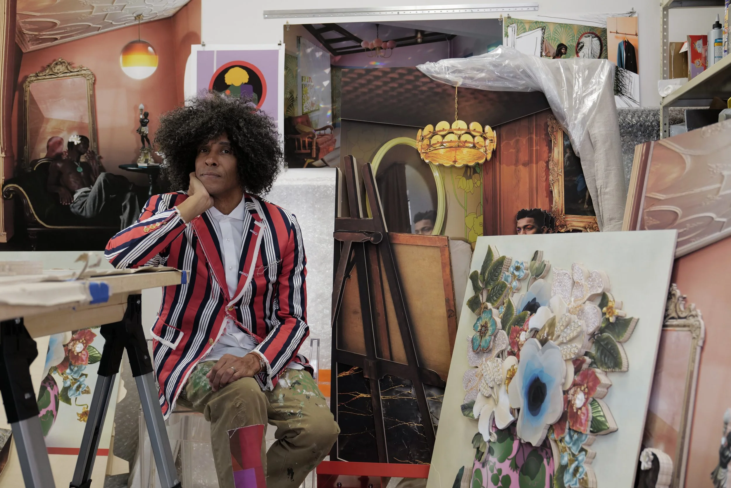
RON NORSWORTHY is an interdisciplinary artist whose broad practice engages the fields of design, art, filmmaking and architecture. His work employs notions of spaces and decoration of space as narratives about his lived experience as a queer person of the global majority as well as that of his community/communities. A foundational belief that the rooms, spaces and environments that we inhabit and interact with speak volumes about not only who we are and our identities, but also our dreams, aspirations and our struggles, informs his work. Through the creation of collaged reliefs, decorative objects, textiles and installations, his work carries the viewer with him through the non-linear, layered story of his life: where he’s been, where he is, and where he’s going or might imagine going.

He's long tapped into the power of space-making as an effective means to share narratives.  As production designer for iconic music videos and televised events, he created worlds that helped visualize the soundtrack of a generation.  As creative director of the eponymous brand, NHOME, developed in limited partnership with home shopping network QVC, he developed and sold his own line of bedding and home accessories on the network.  His products were often inspired by, and sometimes named for, members of his family.  

Ron Norsworthy was born in South Bend, Indiana, raised in Iowa and Illinois and received his bachelor’s degree with honors in architecture from Princeton University.  In addition to his solo practice, Norsworthy is part of DARNstudio, an art collaboration with his husband and fellow artist, David Anthone.

EXHIBITIONS AND ACHIEVEMENTS

In the fall of 2022, he will be doing a residency at Bemis Center for Contemporary Arts, in Omaha, NE; As part of DARNstudio received the 2022 Change Maker Award from the Visual Arts Center of New Jersey; 2020-21 artist-in-residence at Project for Empty Space in Newark, NJ.  ; awarded a printmaking residency (with DARNstudio) at Wassaic Project in 2019; 2019 recipient of the Artistic Excellence Fellowship from the Connecticut Office of the Arts with funding made possible by the National Endowment for The Arts.

DARNstudio developed a workshop for the Hartford Performs organization where their virtual program, DIY FLAGS for SOCIAL JUSTICE, released at the beginning of 2021 has been shared with hundreds of middle school students in the Hartford Public School system.  In 2022, DARNstudio received a grant made possible by the Andy Warhol Foundation to develop their board game, G.O.A.T.:  The Art Game.

His work has been exhibited at the Studio Museum of Harlem, NYC; The Old Stone House, Brooklyn, NY; Visual Arts Center of New Jersey, Summit, NJ; The Wassaic Project in Wassaic, New York; Five Points Gallery, Torrington, CT; Standard Space, Sharon, CT; Project for Empty Space, Newark, NJ; the Governor’s Island Art Fair, Governors Island, NY; Surface Design Journal’s International Exhibition in Print; the International Quilt Museum, Lincoln, NE , the New York Historical Society, New York, NY

His work has been published in Art Quilt Quarterly, Artnet, the New York Times, Glamour, Vogue Italia, InStyle, ID magazine, and New York Magazine among others.  A story on his life and practice first aired on the CBS News magazine, Saturday Morning in August 2022.  

The music videos he’s designed and directed have collectively received hundreds of millions views on YouTube.


Bayard Rustin and Cleveland Robinson by Orlando Fernandez

Bayard Rustin and Cleveland Robinson by Orlando Fernandez

ABOUT THE TYPEFACE

As a Black Queer artist, it will always be important to me to reach back and out in creating and sharing my work; forging and maintaining connections to cultural antecedents that continue to speak to and through me.  In selecting the typeface to use for the titles of this website, I needed to be intentional and choose a font that was not only interesting and original, but that also spoke for me; that I could make my own while still holding a connection to my communities.  Bayard by Tré Seals, founder of Vocal Type Co. was the clear choice bar none.  It’s sans-serif design and variable weights resonates on so many levels for me.  It’s at once classic and novel, disruptive and structured. Perhaps wrong by many design pedagogies and yet somehow perfectly right, simultaneously.  The tension between these different ways of being tracks with dynamic contradictions in my own lived experience. The typeface is inspired by signs from the 1963 March On Washington for Jobs and Freedom, and named for Bayard Rustin, an out Black gay man, who was one of Martin Luther King’s closest advisors and key organizer of the March on Washington and many others during the Civil Rights era.

In 2022,  Tré Seals is among fewer than 4% of professional designers* who identify as Black working in an industry that is overwhelmingly white, despite the fact that the US population is 13% Black.  As embarrassing as it must surely be for the field, and problematic for a public that by mid-century will be majority BIPOC, it must be said that little has changed in the 30 years since my time working as a young artist/designer just out of school trying to figure out where I belonged and long before I realized that I had to create the lane in which wanted to swim, let alone the swimming pool itself.  A friend’s family connection led me to Rich, Butts and Gittens, The Solution, a small, Black-helmed design agency in NYC.  Despite creating cutting edge work for major record labels and branding for emerging East-Coast rappers, The Solution struggled to find a foothold in the market and thus a viable financial model to sustain itself. Despite prodigious talent and distinctive voice the agency lasted only a handful of years.  It’s frustrating to think what could have been if they had the resources, connections and support that their white-led counterparts had, many of which  I later worked for as a set designer, art director and prop stylist.  My time at The Solution was unsatisfyingly brief, but it was foundational.  To work at a design firm led by people who looked like me and that centered Black culture in every project and commission filled me with a sense of pride, identity and purpose that continues to inspire me in my own practice.  The world would literally look different and more beautiful if more young Black artists and designers could have the opportunity to feel what I felt and learn to see, themselves in design as I did.   

So, for me, Bayard represents much more than a typeface.  It’s a mirror and a portal, too.  

To learn more about Vocal Type click here.

* https://www.zippia.com/graphic-designer-jobs/demographics/